
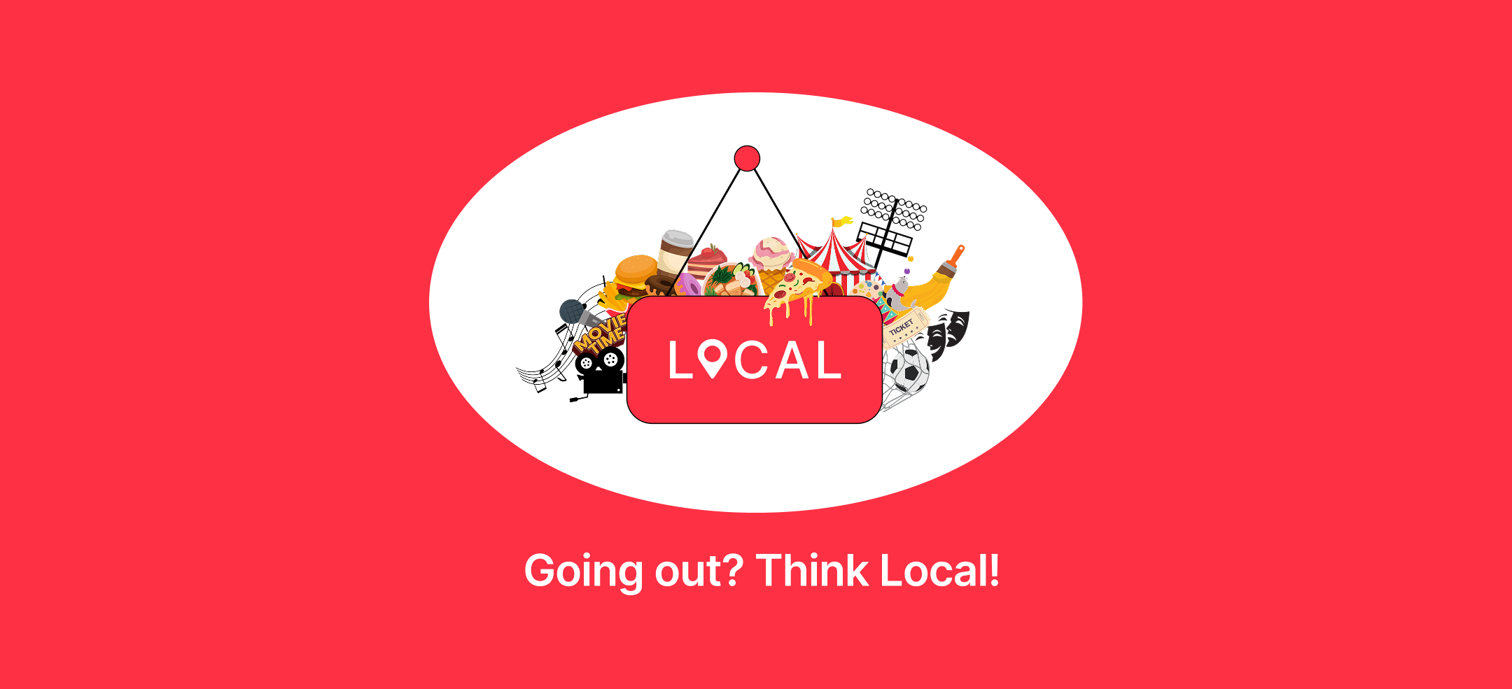
Local
Overview
Local is a Northwestern-backed startup that helps students and residents explore their city through curated events, eateries, and experiences while supporting small businesses and highlighting the cultural heritage of urban spaces through its Legacy section.
During my internship, I led product design across the app and website, handled user research, prototyping, and front-end development, and created branded visual assets and a scalable UI system, all under the mentorship of the CTO and Founders.
My contribution
User Research Ideation UI/UX Design App Development (Front-end) Advertising Content Creation Visual Branding Design System Development Visual Asset Design Product Testing and Audits
Team
Solo Designer (Mentored by Founders)
Timeline
June 2024 - May 2025
Problem
- Disconnected Local Businesses: Local vendors struggle to attract students, despite being located just blocks away from campus
- Lack of Student Awareness: Students are often unaware of events, deals, and cultural spots around them leading to missed experiences
- Generic Existing Platforms: Tools like Google Maps, Yelp, and Eventbrite are too broad, impersonal, or poorly localized for student needs
- No Unified Discovery Tool: There’s no platform that combines student-only deals, real-time local discovery, and easy group planning
- Underrepresented City Heritage: Legacy businesses and cultural landmarks often go unnoticed, lacking digital presence or community recognition
Goal
Design a platform that connects students and city residents with nearby local vendors, encourages city exploration, supports small businesses, and highlights the cultural legacy of urban spaces, all through a seamless and intuitive user experience.
Design Process - Website for Vendors
Research
To understand vendor needs, I analyzed onboarding sessions and internal conversations with 300+ local businesses that had signed up in Evanston. I also referred to insights from Local’s team that had interacted directly with vendors.
Comparative Analysis of Existing Tools
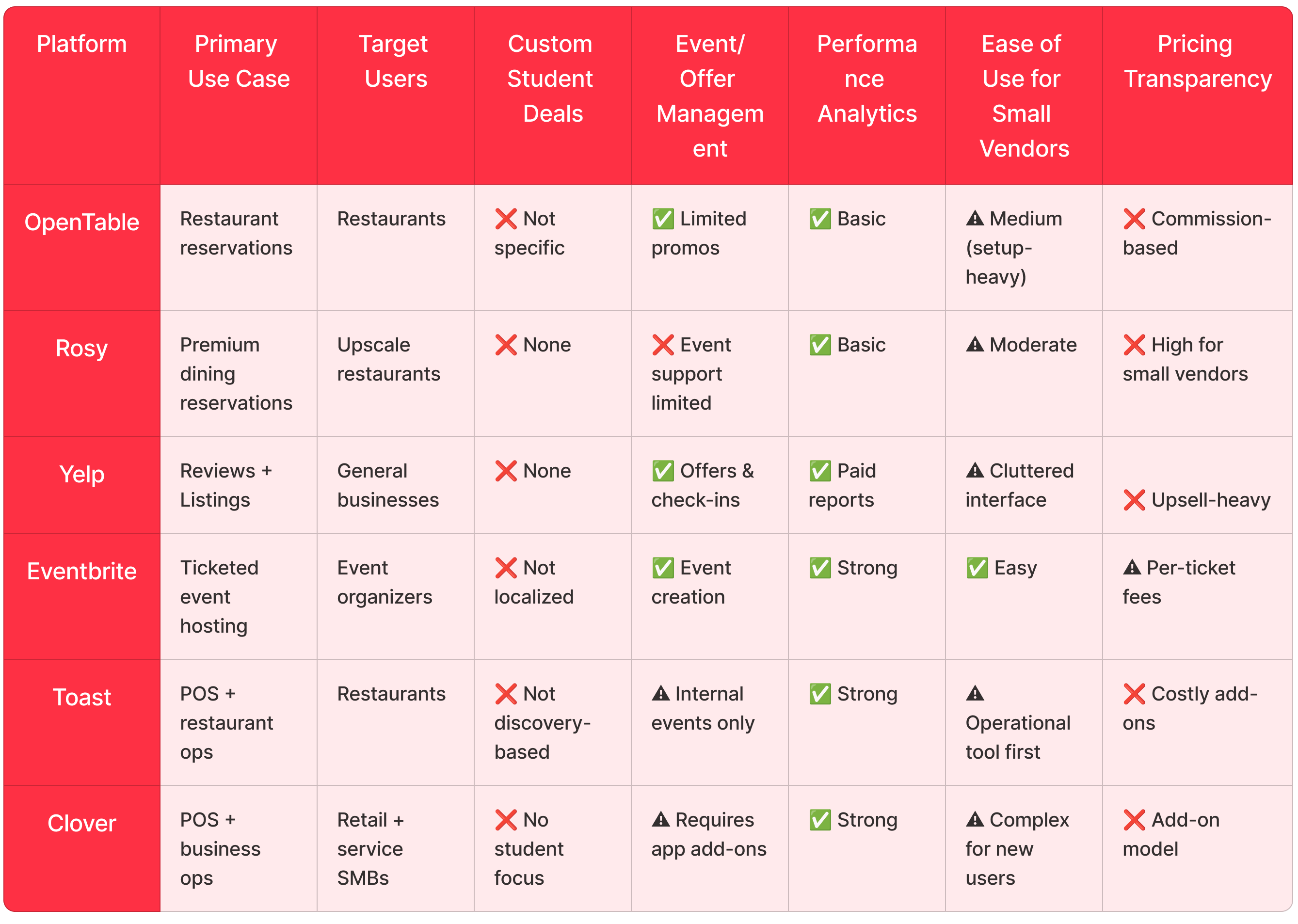
While each tool serves a function, none provide:
- Hyper-local discovery tailored to students and residents
- Built-in user-facing visibility and branding
- Easy, low-friction posting of events/deals
- Clear insights into what’s working
- An interface built with varying digital comfort levels in mind
Most importantly, many vendors weren’t tech-averse. They were simply time-constrained and needed tools that didn’t assume technical fluency.
“We’re not tech people — just tell us where to click and what to write.”
This underscored the importance of building something accessible, efficient, and intentionally non-intimidating.
Research → Ideation
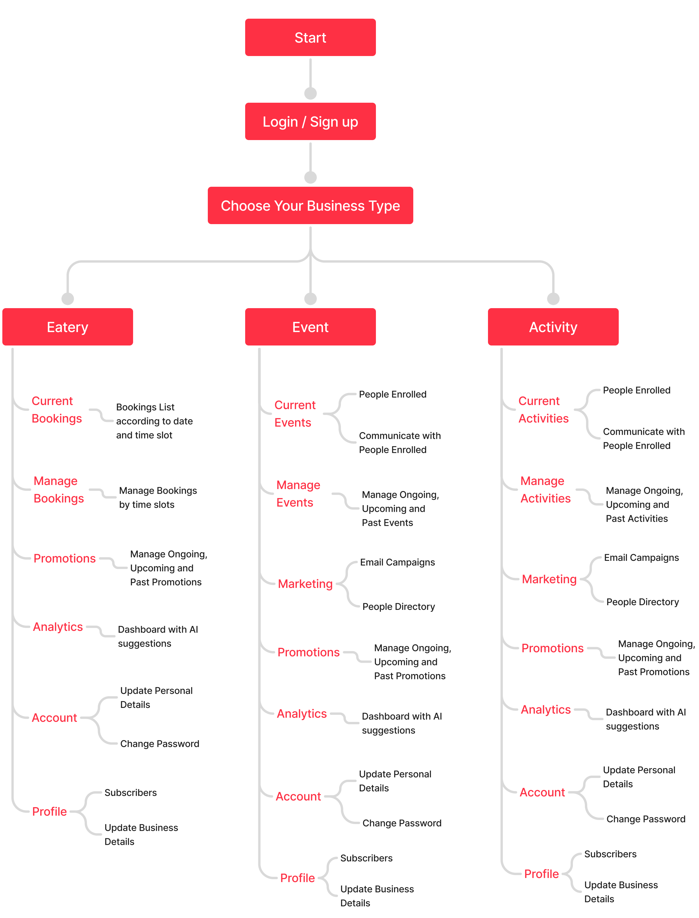
After gathering vendor insights and competitor analysis, I mapped out the end-to-end vendor journey, from registration to events and promotion creation and performance tracking. The ideation phase focused on creating a system that feels approachable, scalable, and aligned with how local vendors actually work.
I broke the design into five logical areas based on usage and business types:
- Onboarding: Simple, familiar flows (sign-up/login) + business-type-based pathing
- One-time Setup Forms: Divided by business types (Eateries, Events, Activities) and structured to reduce friction — with optional visual assets to prevent drop-off
- Core Operations: Each business type gets dedicated pages for live tracking, management, promotions, and communication
- Analytics & Profiles: While vendors didn’t initially know what metrics they needed, I laid the groundwork for scalable analytics and personalization
- Marketing Tools: Empowered vendors with email campaigns and audience targeting through People Directory, allowing them to build relationships, not just transactions
To avoid overwhelming users and ensure success across varying digital literacy levels, the UX focused on:
- Chunking content into modular screens
- Gradual data input with only required fields marked
- Rich, structured UI patterns with visual blank states
- A clear information hierarchy tailored to vendor needs
Information Architecture
Research → Ideation → Design
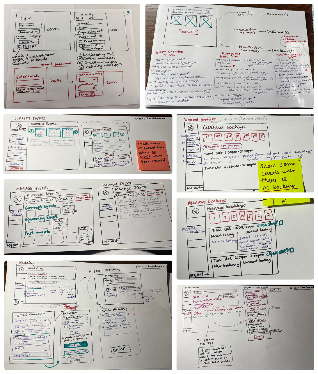
Early ideas were translated into structured wireframes that focused on clarity, simplicity, and ease of use. The high-fidelity designs were kept intentionally minimal to accommodate varying levels of digital literacy among vendors.
Low-fidelity Wireframes
Research → Ideation → Design → Testing & Iteration
How Testing Was Conducted
Before finalizing the high-fidelity designs, I conducted observation-based usability testing using mid-fidelity wireframes with local vendors across food, event, and activity categories. These remote moderated sessions involved 50 participants completing common tasks like uploading listings, managing bookings, and creating promotions through interactive Figma prototypes and live flows.
The goal was to validate flow clarity, and uncover edge cases, especially for first-time digital users. I observed their interactions, noted areas of confusion, and conducted brief post-task interviews to gather qualitative feedback. These insights directly informed key design changes.
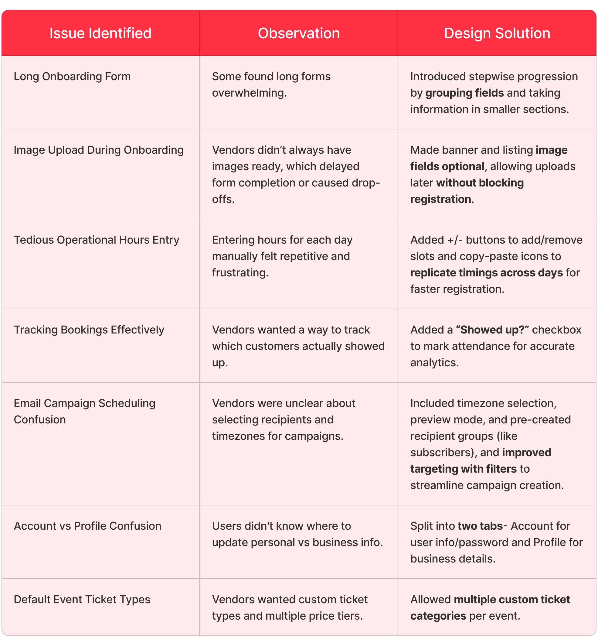
Design Changes
Research → Ideation → Design → Testing & Iteration → Final Design
Due to NDA restrictions, I’m unable to share the final design visuals publicly. Please feel free to contact me directly if you’d like to learn more about my work.
Design Process - Mobile Application for Students & Residents
Research
Before designing the App, I focused on understanding the habits, expectations, and pain points of the core users- Northwestern students and Evanston residents. This involved reviewing past internal surveys, feedback from early adopters, and informal interviews with students.
Findings
These insights laid the foundation for features like Decks, timed coupons, karma-based rewards, and legacy content — all focused on relevance, spontaneity, and fun.
Research → Ideation
Building on the research insights, I sketched ideas to create an app that is rewarding, personal, and effortless to use.
Major ideation directions:
- Dynamic Discovery Feed: Designed a Home screen rich with sections like “In The Limelight,” “What Are You Looking For?”, “Recommended For You,” and “Must Tries in Your Location” to combat planning fatigue and offer context-based browsing.
- Smart Booking Flows: Developed two flow options. “Book a Table” for confirmed reservations and “Instant Booking” for walk-ins to accommodate different vendor booking policies while keeping users flexible.
- Timed Coupons: Created a coupon activation model with a 15-minute countdown to foster impulse use and make the experience feel spontaneous and rewarding.
- Gamification with Karma Points: Introduced Karma points as a core engagement mechanic, integrated across the app; earned via bookings, reviews, and referrals; usable to unlock discounts and boost user satisfaction.
- Themed Decks for Curated Exploration: Crafted Decks such as “Sweet Tooth,” “Bar Hopping,” or “Legacy Spots” to tap into different moods and exploration styles, offering both algorithmic and manual discovery pathways.
- Social Planning: Mapped out ideas for group bookings, simple chat, and even a personality-based pairing feature to enhance social engagement and community feel.
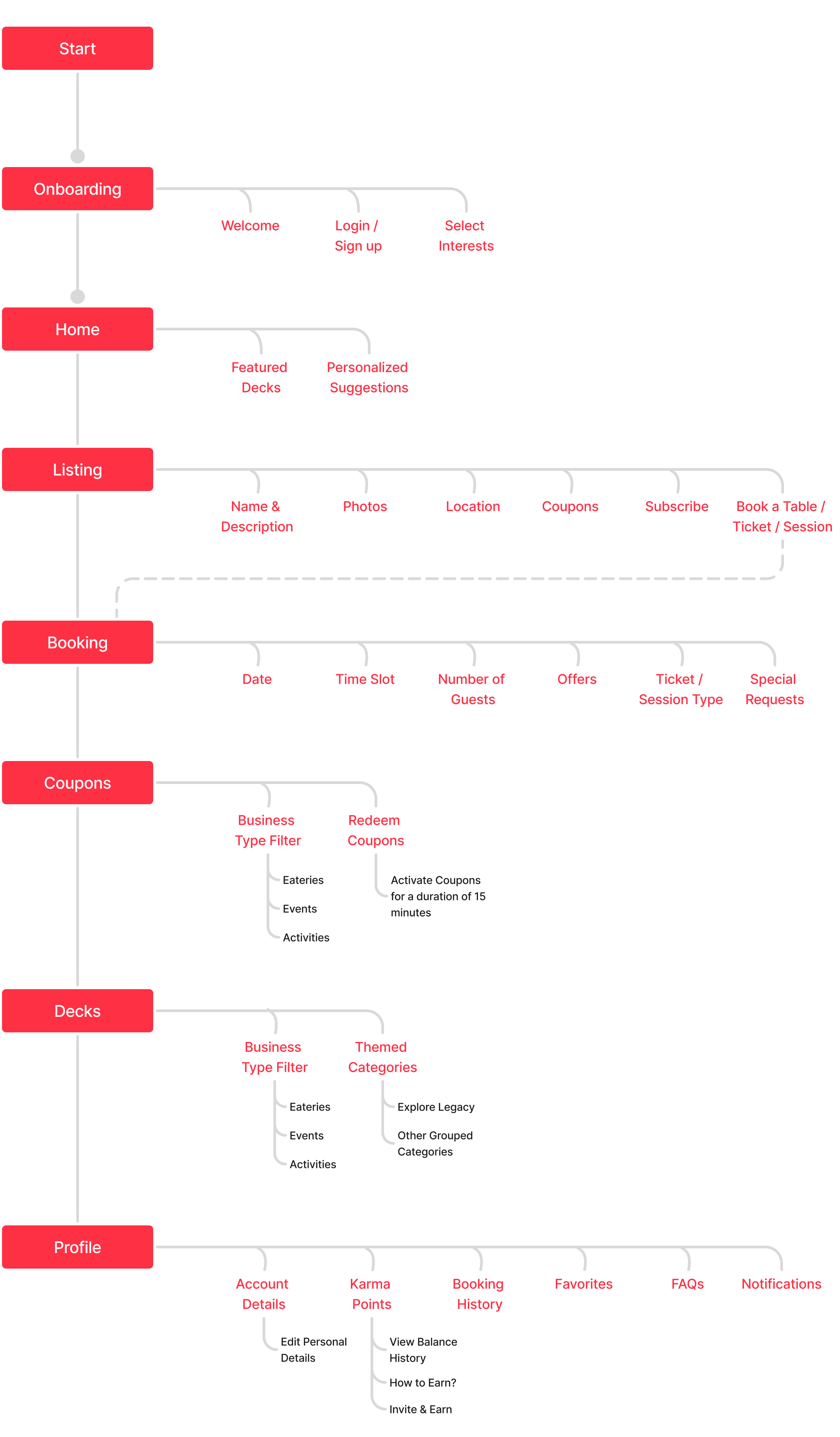
Information Architecture
Research → Ideation → Design
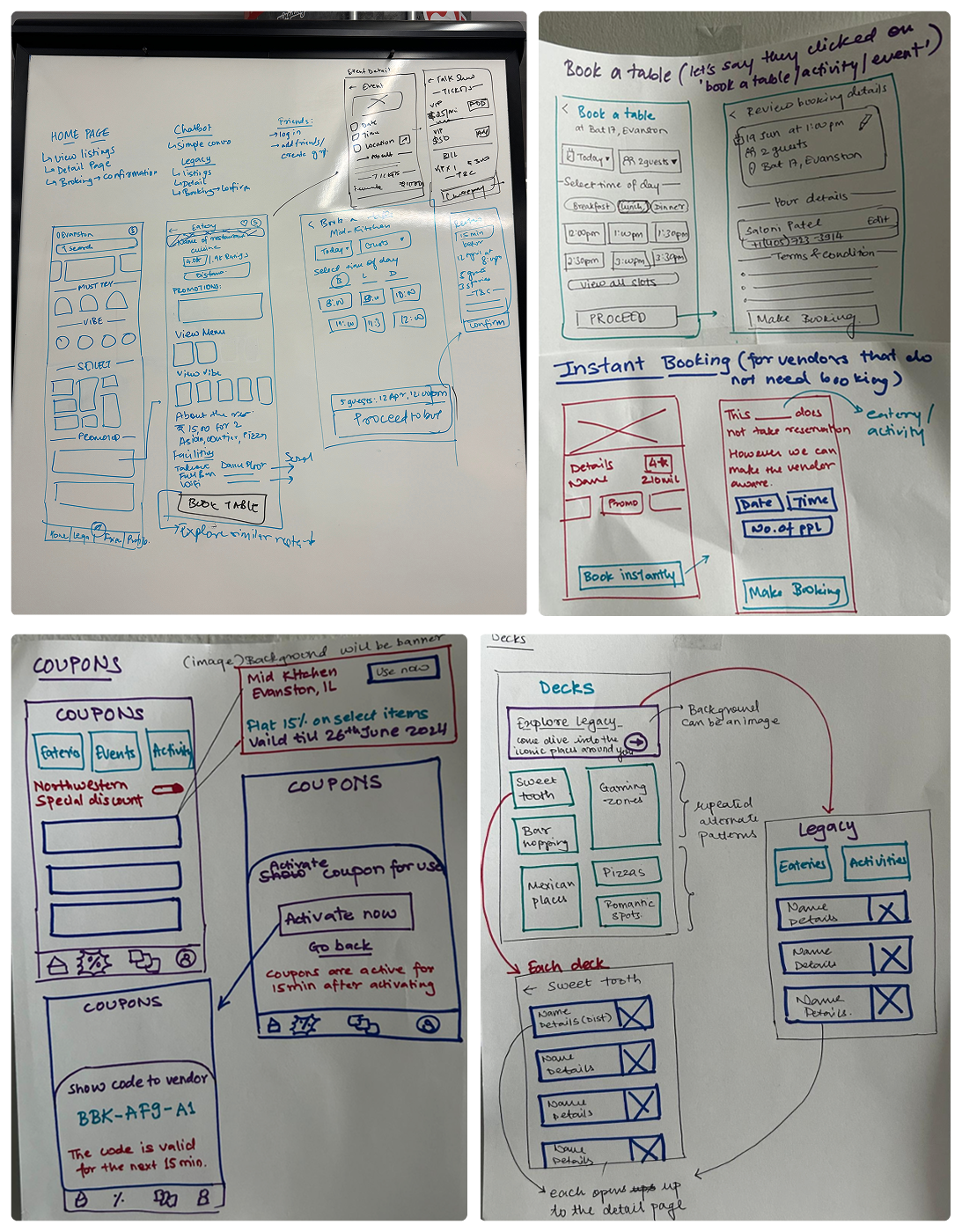
I sketched low-fidelity wireframes to explore layouts and flows, focusing on clarity and ease of use.
Low-fidelity Wireframes
Research → Ideation → Design → Testing & Iteration
How Testing Was Conducted
To validate early design decisions, I conducted task-based usability testing with 50 Northwestern students and 50 Evanston residents having different planning styles, using high-fidelity Figma prototypes. Participants were asked to complete common actions such as exploring Decks, redeeming local coupons, and checking Legacy content. I observed their behavior, noted moments of hesitation, and gathered feedback through short interviews.
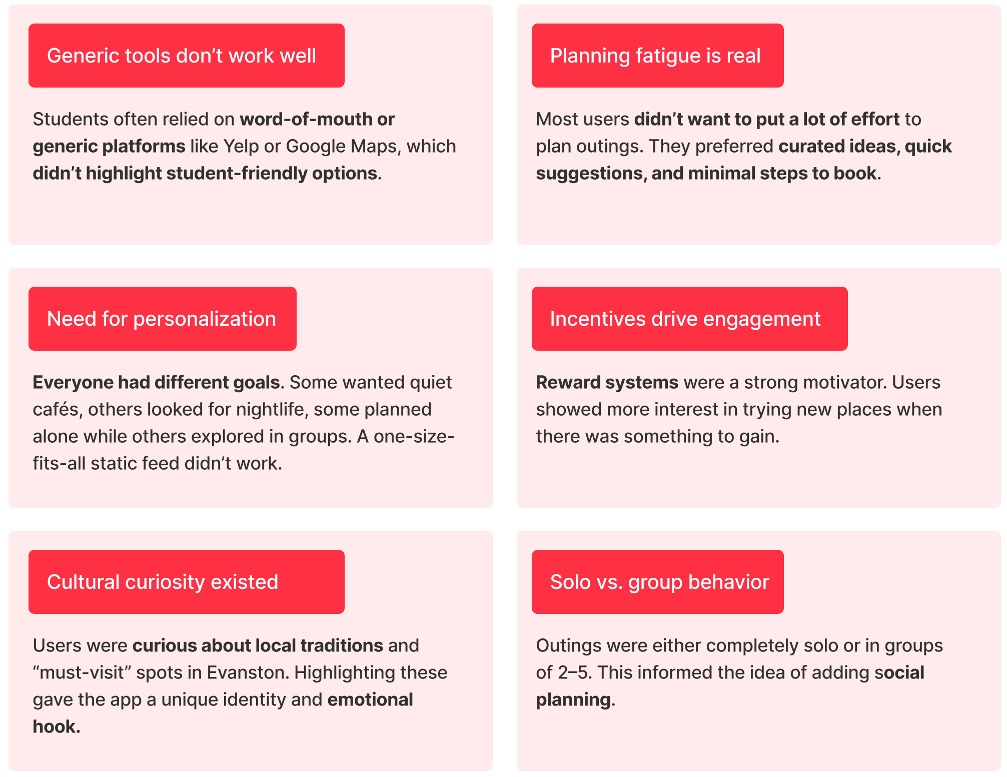
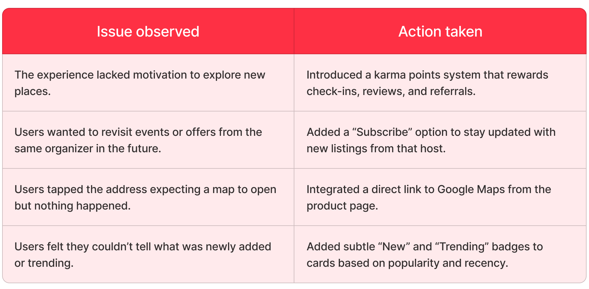
The testing highlighted a few critical insights.
Research → Ideation → Design → Testing & Iteration → Final Design
Due to NDA restrictions, I’m unable to share the final design visuals publicly. Please feel free to contact me directly if you’d like to learn more about my work.
Impact
- Positioned to serve 10,000+ students and residents across Evanston through hyperlocal events, vendor listings, and exclusive deals
- Vendor onboarding time under 15 minutes, with an 80% retention rate after the first month
- 300+ local businesses signed up in Evanston, validating strong market demand
- 200+ vendor-driven promotions launched independently through the platform
- $714,000 post-money valuation, with strong institutional backing from Northwestern’s Community Relations and Procurement divisions
Time to reflect!
Working at Local pushed me to think beyond visuals and focus on building for scale, clarity, and long-term usability. As the sole designer, I was not just executing tasks but also making product decisions, aligning with business goals, and turning ideas into a product that meaningfully connected students with small businesses.
This experience helped me grow into a more thoughtful designer who can balance design thinking with technical constraints, combine branding with usability, and align user needs with business outcomes.