
Swach Bharat (Clean India)
Overview
Swach Bharat is a waste management mobile app concept designed during a UI/UX Design competition “Pixel Paranoia”.
The project aims to tackle urban waste management challenges by creating a citizen-centric platform that simplifies waste segregation, disposal, and reporting. The app focuses on driving active participation through intuitive design, informative resources, and interactive features that promote sustainable practices in urban communities.
My contribution
End-to-end product design
Team
2 × designers
Timeline
December 2024 - 6 hours (Hackathon Project ✨)
Problem
- Unclear guidelines on waste segregation and recycling.
- Limited access to nearby disposal points or recycling centers.
- No proper system for waste tracking (generated, recycled, disposed).
- Low citizen engagement in daily waste management.
- Lack of a simple way to report waste-related issues to municipal bodies.
Goal
- Encourage active citizen participation in waste disposal and recycling.
- Provide clear segregation guidelines and easy access to disposal points.
- Enable waste tracking and reporting to authorities.
- Design an intuitive, clean interface that drives daily engagement.
Design Process
Empathize
Objective
To understand the existing behaviors, challenges, and motivations of urban citizens regarding waste disposal and segregation, and identify gaps in current waste management solutions that hinder active participation.
Secondary Research
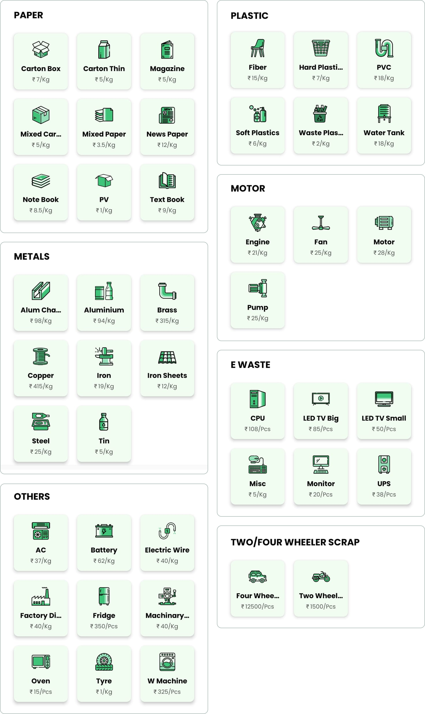
Studied articles, municipal reports, and infographics explaining waste segregation rules.
Identified 7 primary waste categories (with subcategories) to simplify segregation for users.
Government Guidelines
Under the Municipal Solid Waste Management Rules, 2016, all waste generators across Indian urban areas were mandated to segregate waste into three mandatory streams at source:
- Wet (Biodegradable)
- Dry (Plastic, Paper, Metal, Wood, etc.)
- Domestic Hazardous Waste
Expanded Categories Based on National Reports
OOur research extended these into up to seven usable categories, aligning with the MoEFCC’s and CPCB’s broader waste classification structure:
- Wet/Biodegradable
- Dry Recyclable
- Domestic Hazardous Waste- E‑Waste
- Battery Waste
- Biomedical / Medical Waste- Construction & Demolition Debris
Primary Research
Explored behavioral patterns regarding recycling, disposal habits, and awareness levels.
Given the time constraints of the hackathon, we conducted 10 informal interviews with people of varied age groups, including college students, working professionals, and older adults. We also discussed with our hackathon mentors to understand their perspectives.
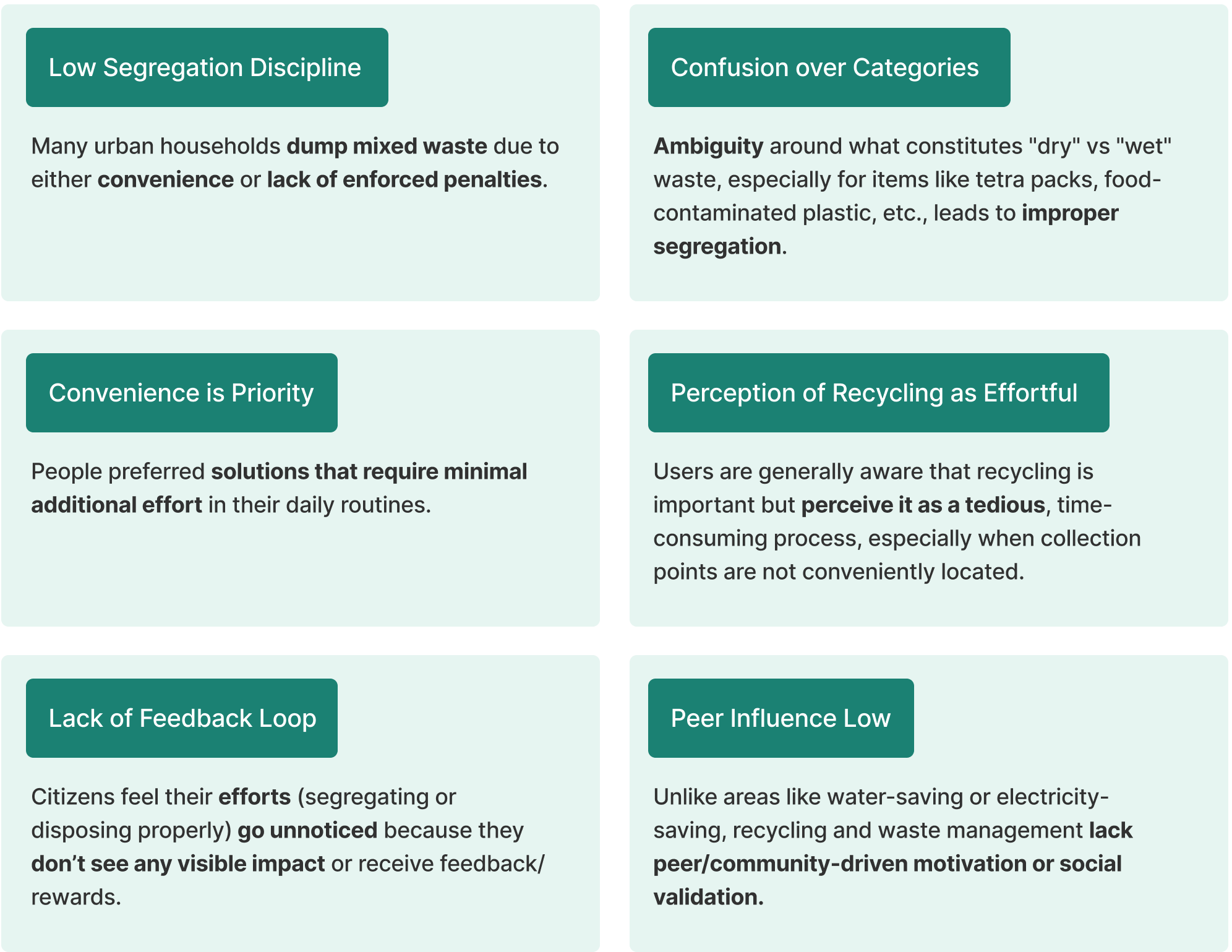
Findings on Recycling & Disposal Behaviors
Competitor Analysis
We reviewed several Indian and international waste management platforms to benchmark best-in-class features and identify key gaps:
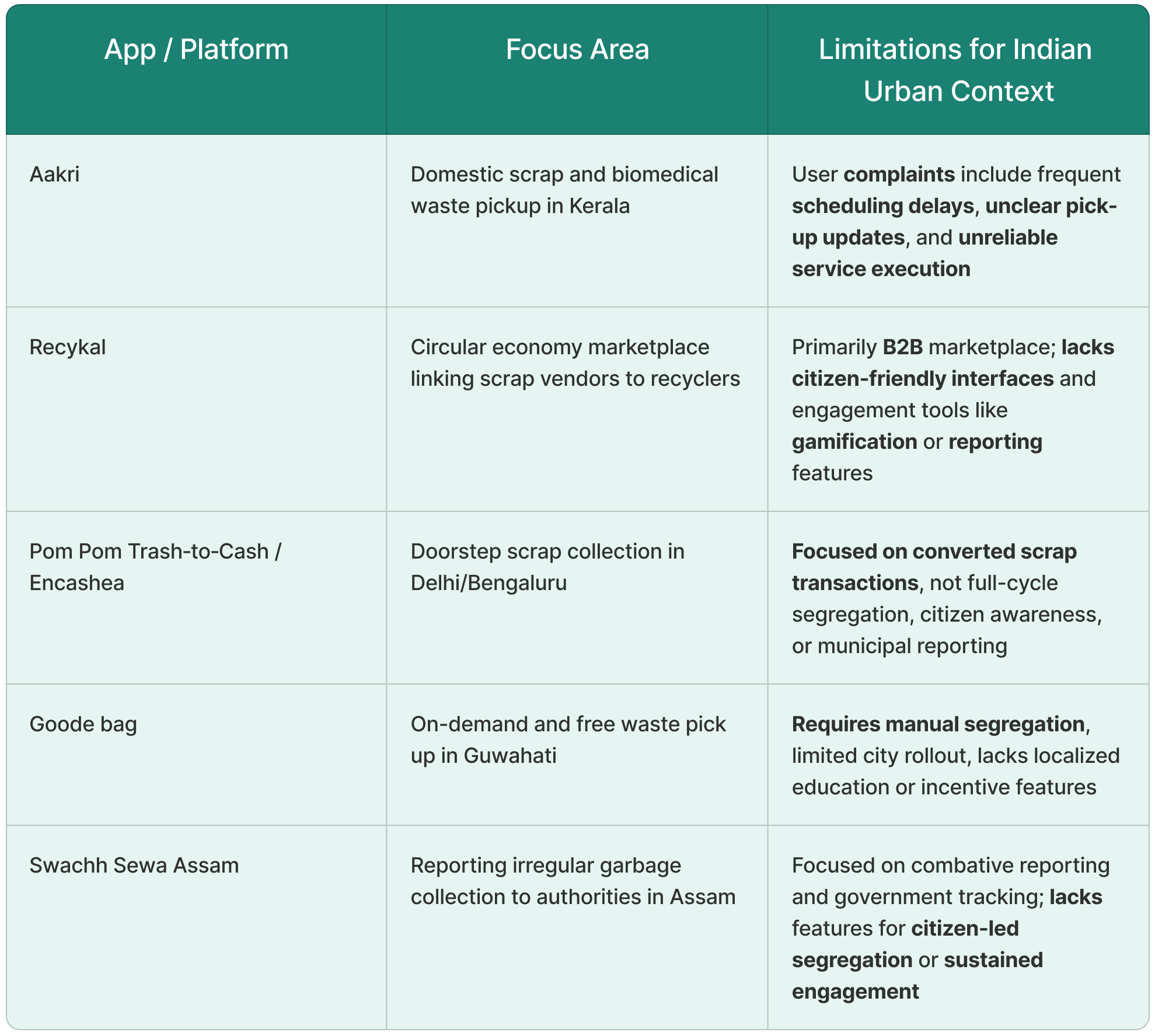
Analysis & Opportunity
- These apps typically focus on reporting or single-service arrangements.
- None offer an integrated solution combining segregation guidance, reward systems, localized content, and direct citizen-to-authority channels—all essential for a scalable and engaging urban platform.
- Existing solutions often fail in reliability, trust-building, or serving diverse urban demographics, validating our goal of designing a holistic, citizen-centric waste management app.
Empathize → Define
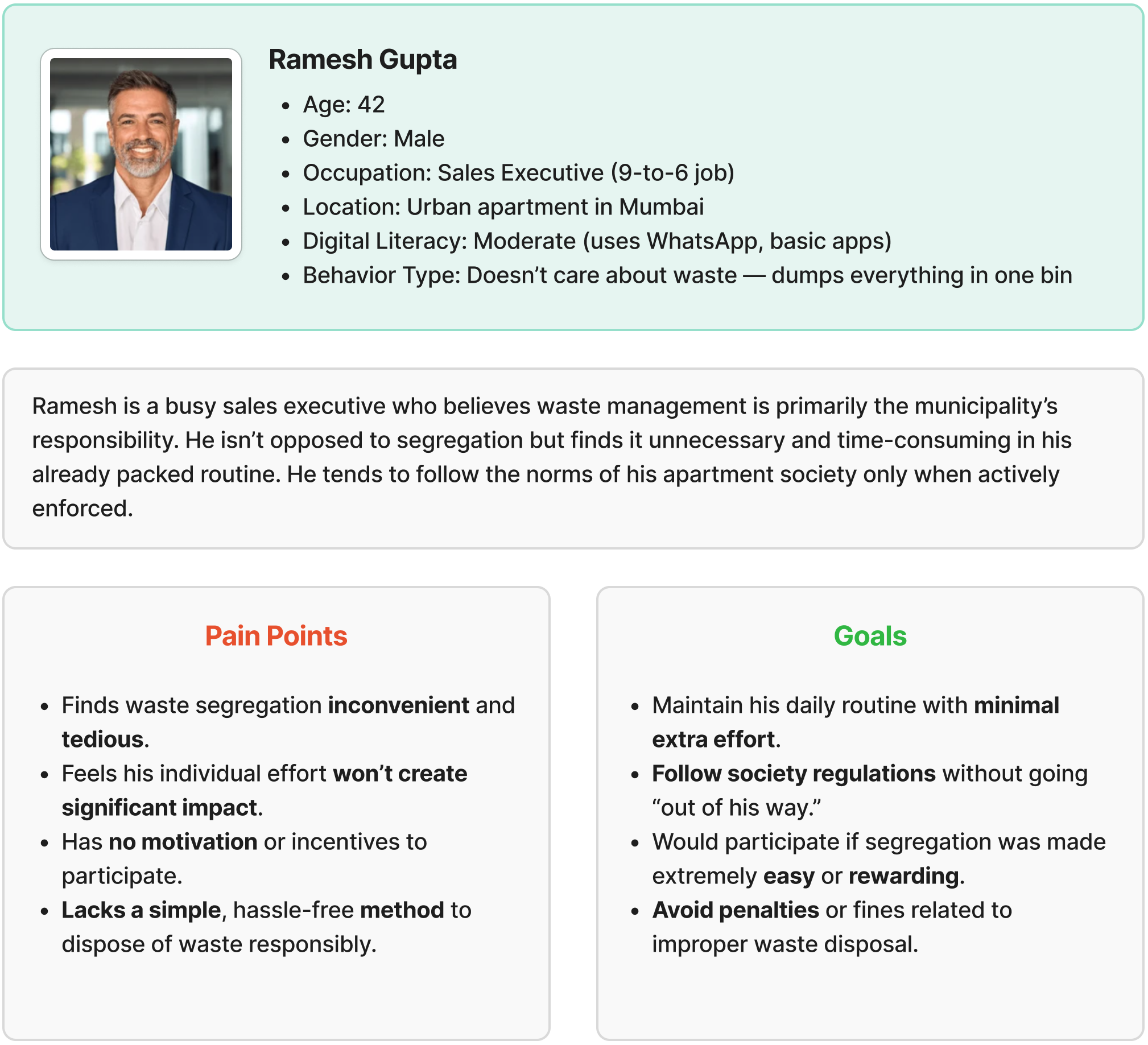
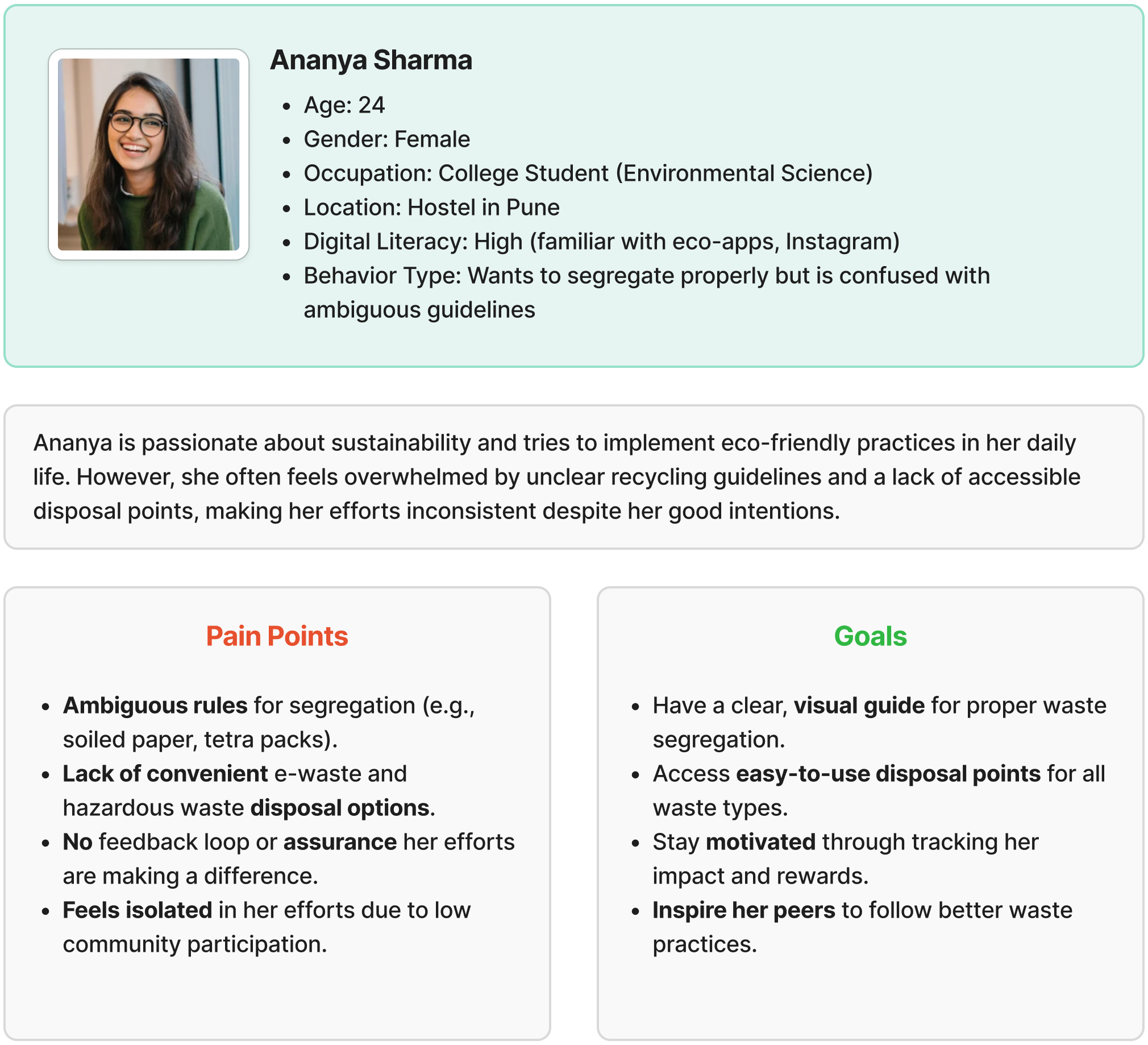
User Personas
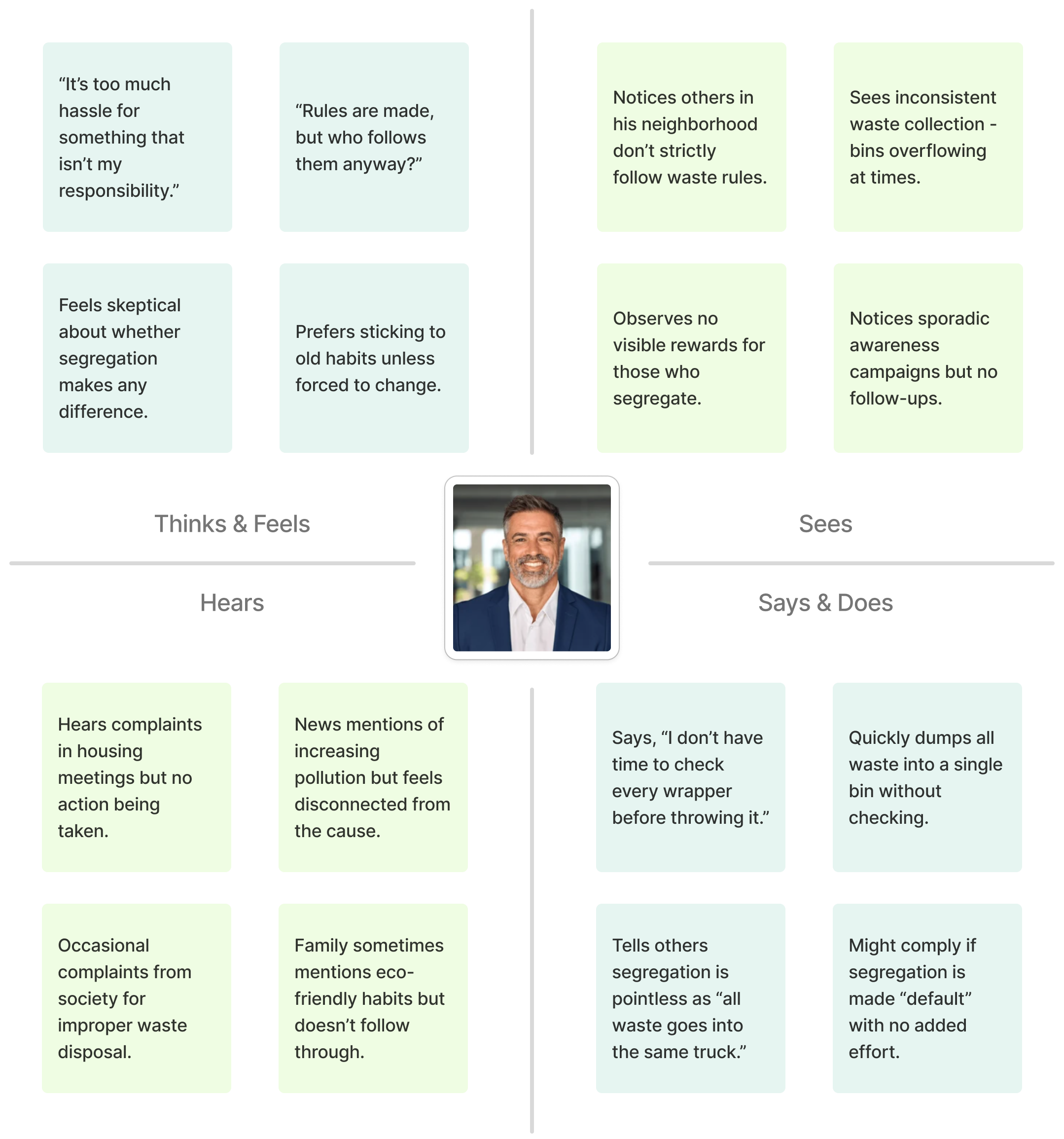
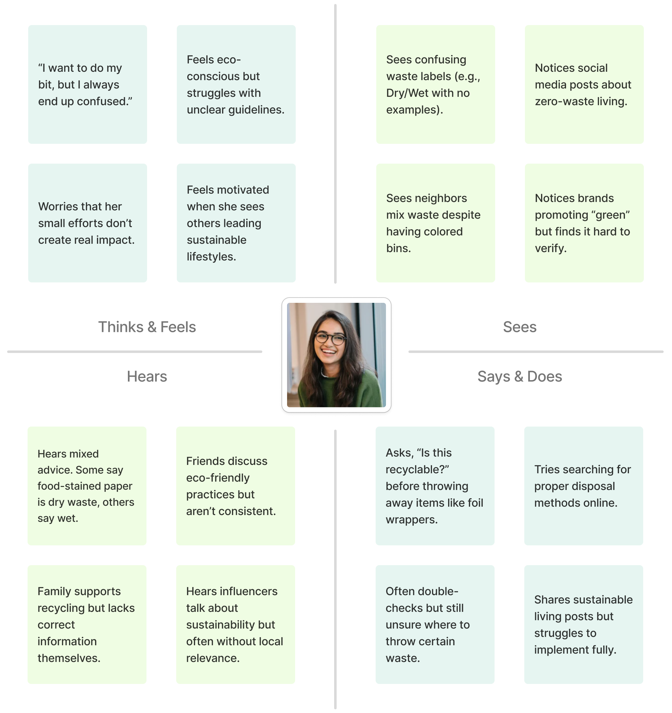
Empathy Maps
Empathize → Define→ Ideate
Using insights from personas and empathy maps, we ideated features to simplify waste segregation, promote active recycling, and ensure ease of use. These were structured into a clear Information Architecture aligned with user needs.
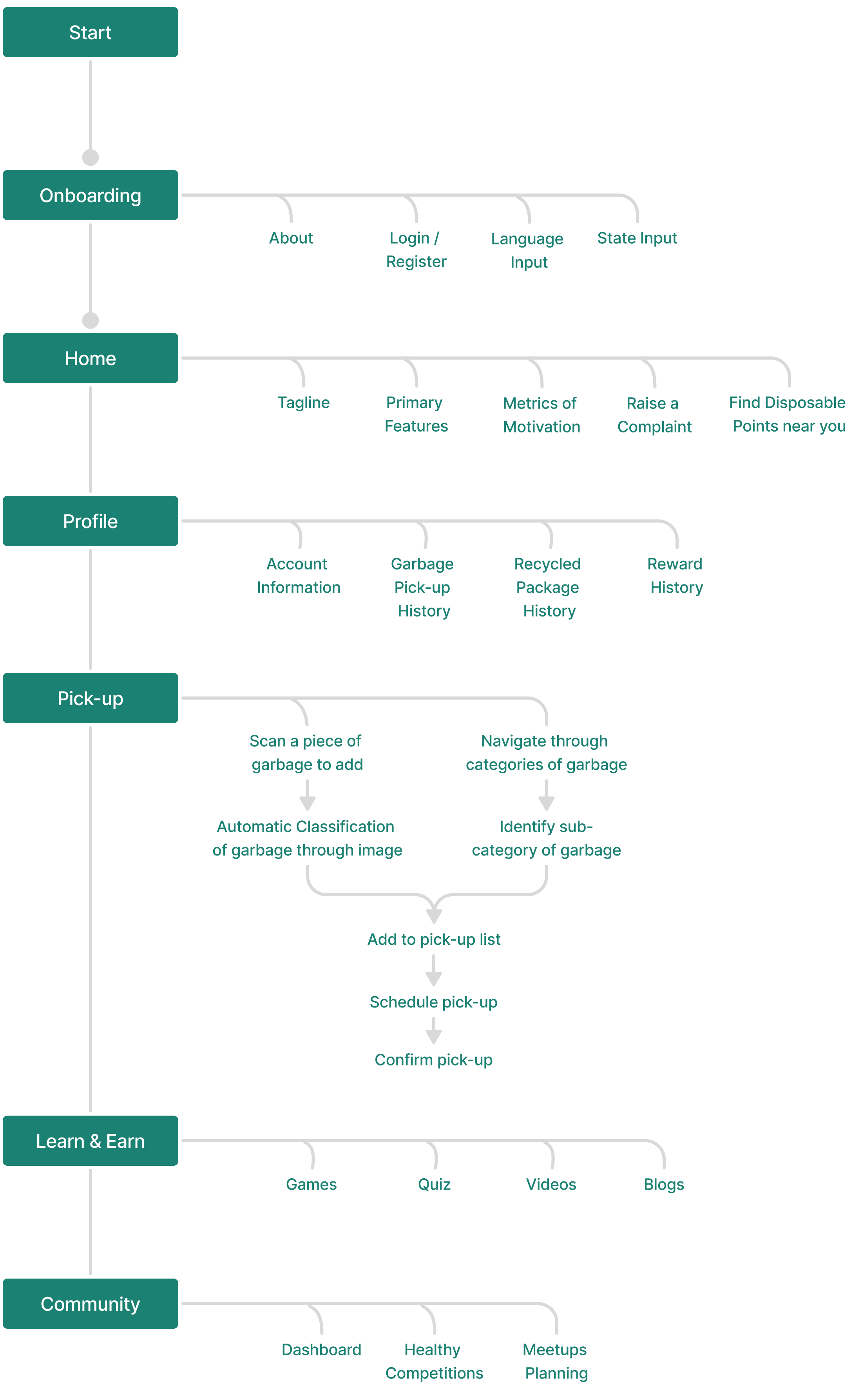
Information Architecture
Empathize → Define→ Ideate→ Prototype
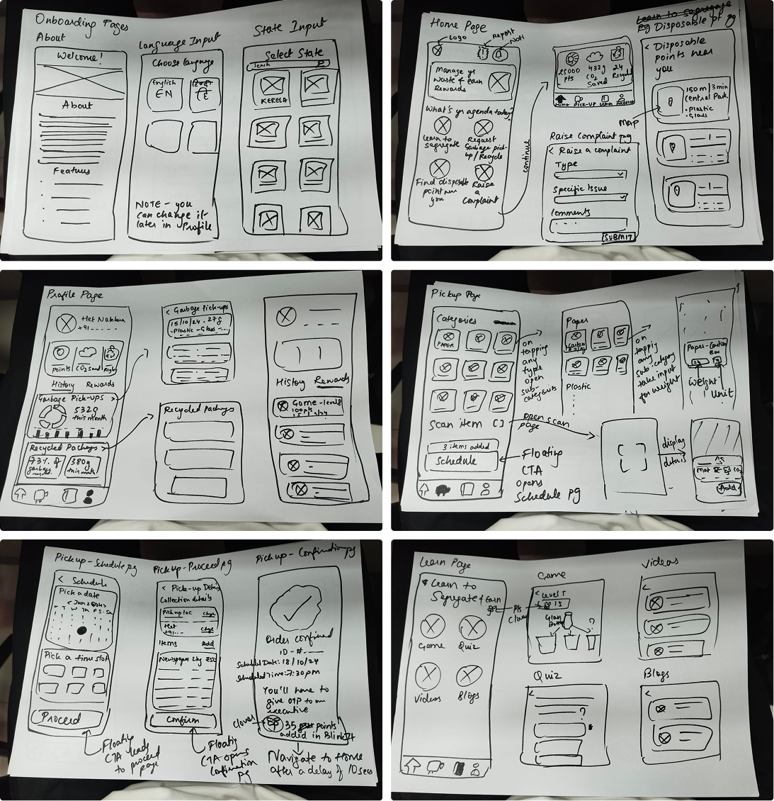
Low-fidelity Wireframes
Translating to screens.
Principles of Cognitive Psychology were embedded throughout, ensuring intuitive interactions and reducing friction. Key considerations included:
- Gestalt Principles for visual grouping and hierarchy
- Mental Models to align design patterns with user expectations
- Cognitive Load Reduction by simplifying flows and minimizing unnecessary steps
- Reachability (Rule of Thumb) ensuring all primary actions are within comfortable thumb zones for mobile use
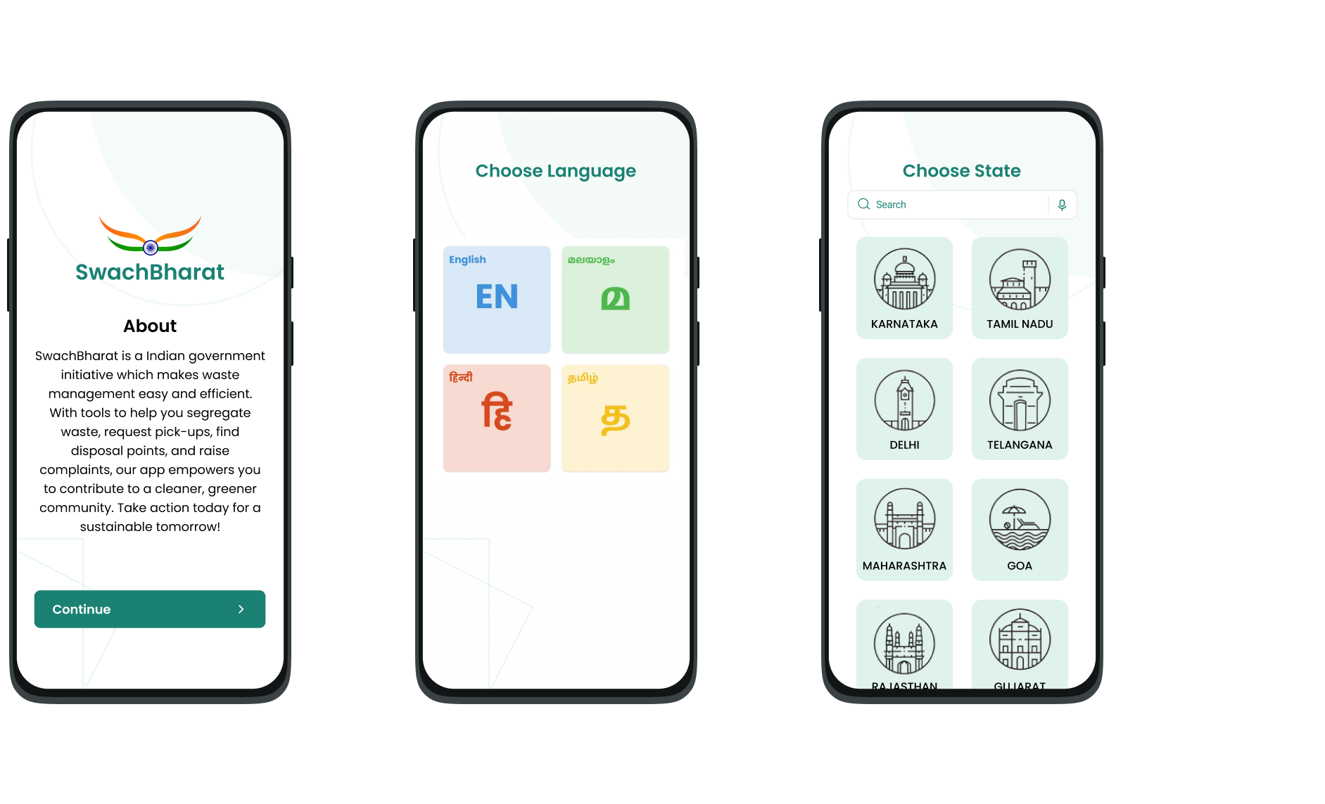
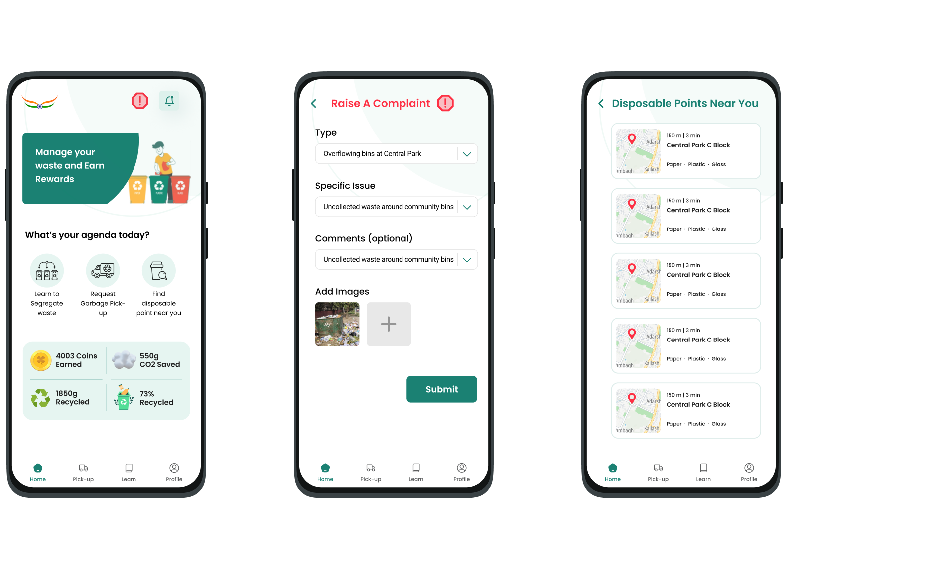
High-fidelity Prototypes
These wireframes laid the foundation for a clean and minimal high-fidelity UI that encourages daily engagement while reducing cognitive load.
Onboarding
Home
Profile
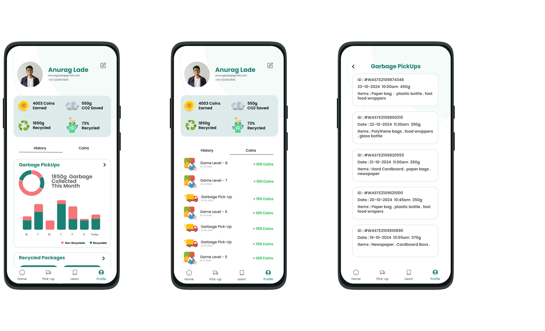
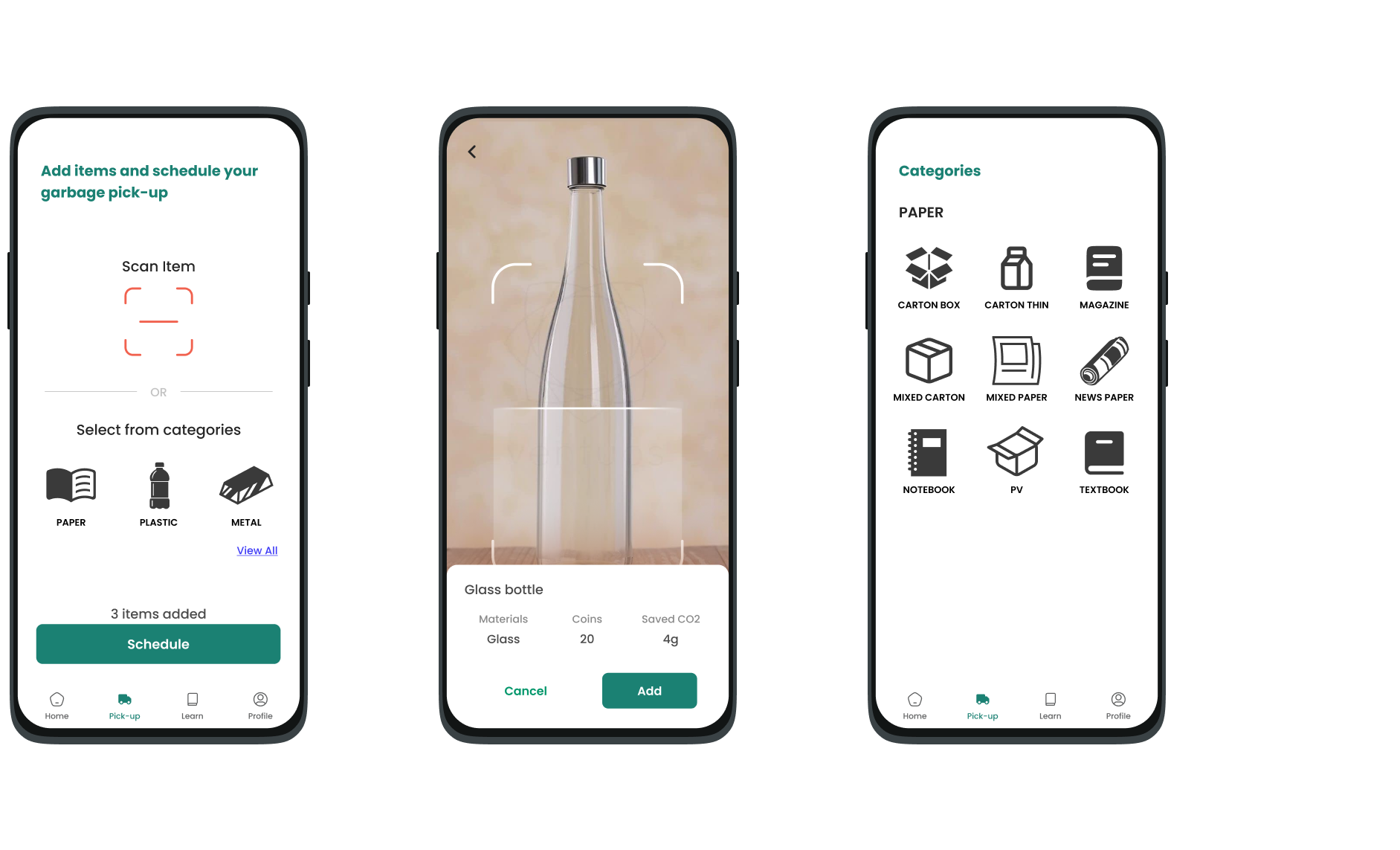
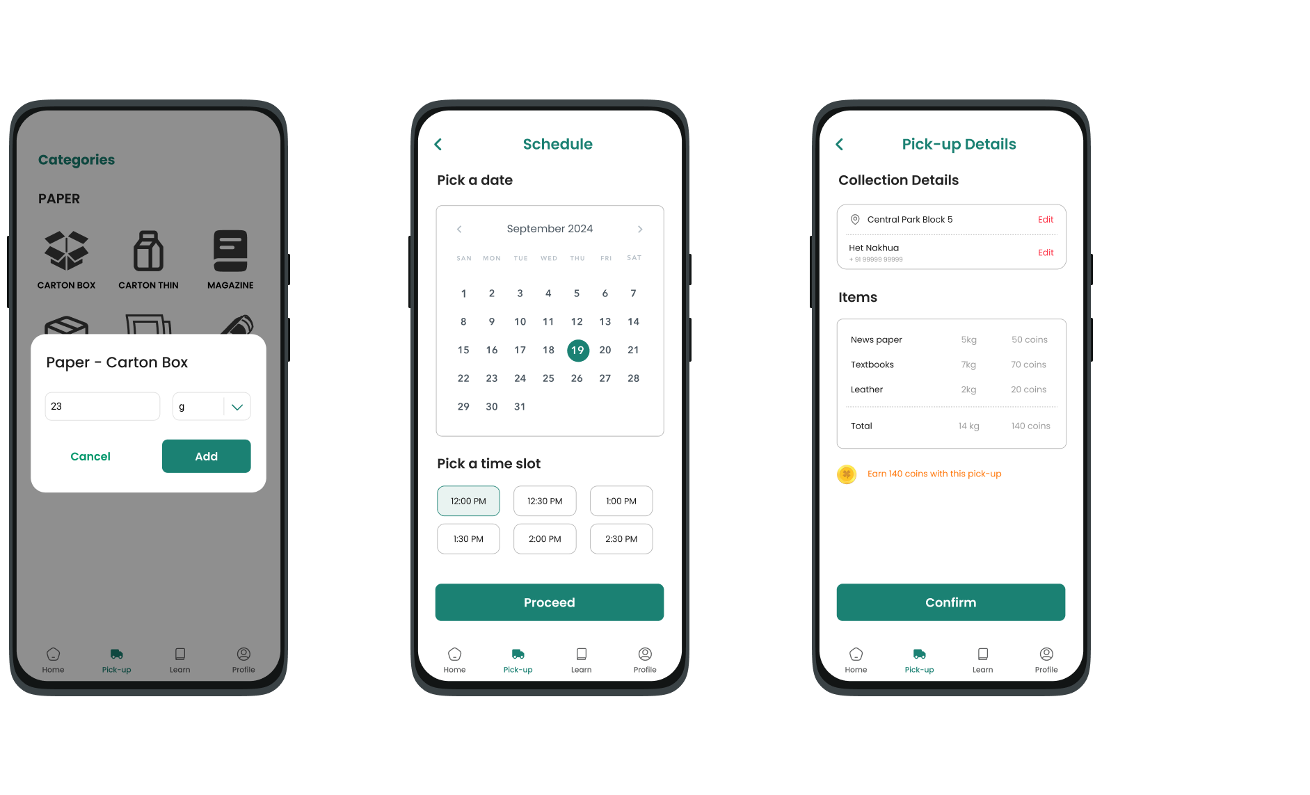
Pick-up
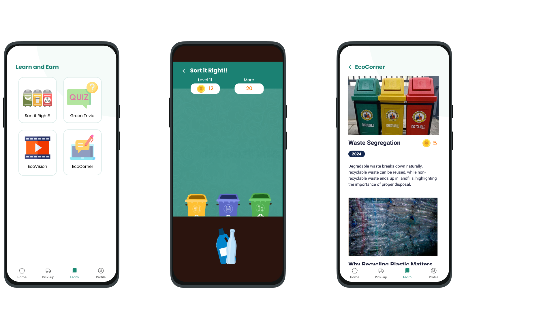
Learn & Earn
Empathize → Define→ Ideate→ Prototype → Test
We conducted rapid usability testing using interactive mid-fidelity prototypes with a diverse set of 10 users, including students, working professionals, and senior citizens.
Tasks Included:
- Segregating waste into correct categories during disposal.
- Locating the nearest disposal point using the app.
- Reporting an uncollected garbage spot.
- Tracking personal recycling stats and impact.
- Understanding waste segregation guidelines through the app’s Learn & Earn gamified section
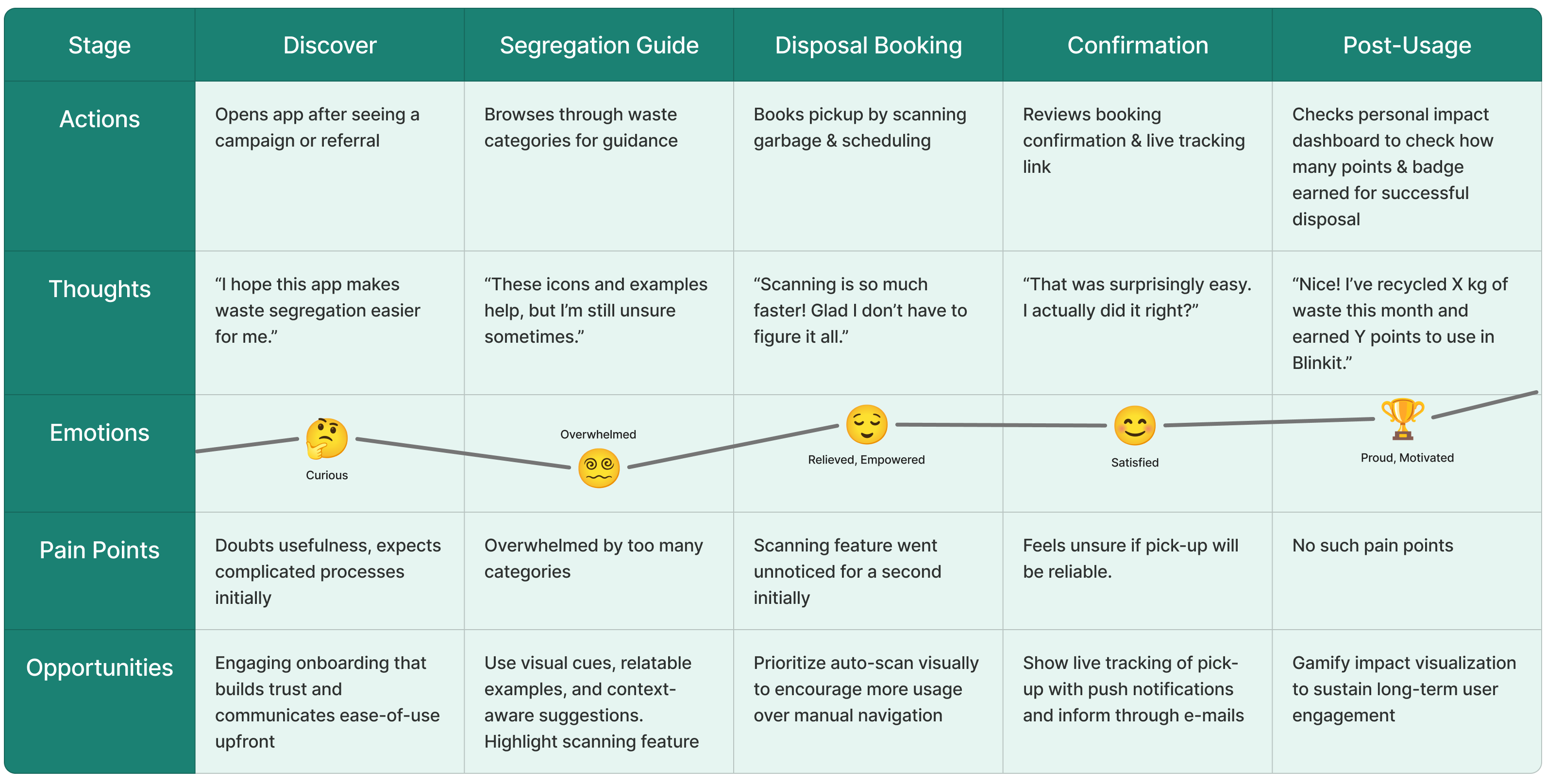
We recorded these observations as a user journey map.
Design Improvement (Testing Insight)
Observation:
Users preferred the automatic “Scan Garbage Item” feature to identify waste type but found it hidden and less accessible compared to the manual category selection.
Design Change:
We redesigned the waste addition screen to prominently feature the scan function, allocating nearly half of the screen space to encourage its use. This reduced friction, minimized user confusion, and aligned with the user's natural tendency for quicker actions over manual browsing.
Time to reflect!
Working on Swachh Bharat during Pixel Paranoia was a crash course in balancing user-centric design with extreme time constraints. Within 6 hours, we had to understand behavioral patterns, ideate, prototype, and validate core features - all while ensuring the solution resonated with Indian urban citizens and their unique mindset towards waste disposal.
This project sharpened my ability to prioritize usability over complexity, focusing on simple, guided experiences for users who often perceive waste segregation as tedious. Designing for varying levels of digital literacy, we made conscious UX choices like simplifying waste categories, using visual aids, and reducing steps to encourage participation.
One of my biggest takeaways was how cultural context deeply influences design decisions. Unlike global recycling apps, Indian citizens needed clarity, motivation, and trust-building, which shaped our feature set.
Overall, this hackathon reinforced the importance of designing for behavior, not assumptions, and taught me how to create impact within constraints.